Getting familiar with Kibana
We’ve been using Elasticsearch a lot over the past year. It’s a fantastic distributed data store and can do lots more than just power search in your application. Elastic’s ELK stack includes Elastic, Logstash, and Kibana. Elastic and Logstash each merit their own discussion. Right now I want to focus just Kibana, which is how you can explore and visualize data in an Elasticsearch index.
As a long-time Tableau user, I wanted to see how well I could create the same visualization in Kibana that I’ve previously created in Tableau. Although Kibana doesn’t yet have all the functionality as Tableau, it has the basics covered. So here’s what I did.
Data source
I used a data set constructed from a sample of SSRS log records from our production reporting environment. We have historically mined this data to dig into potential performance issues and also as a great product management resource.
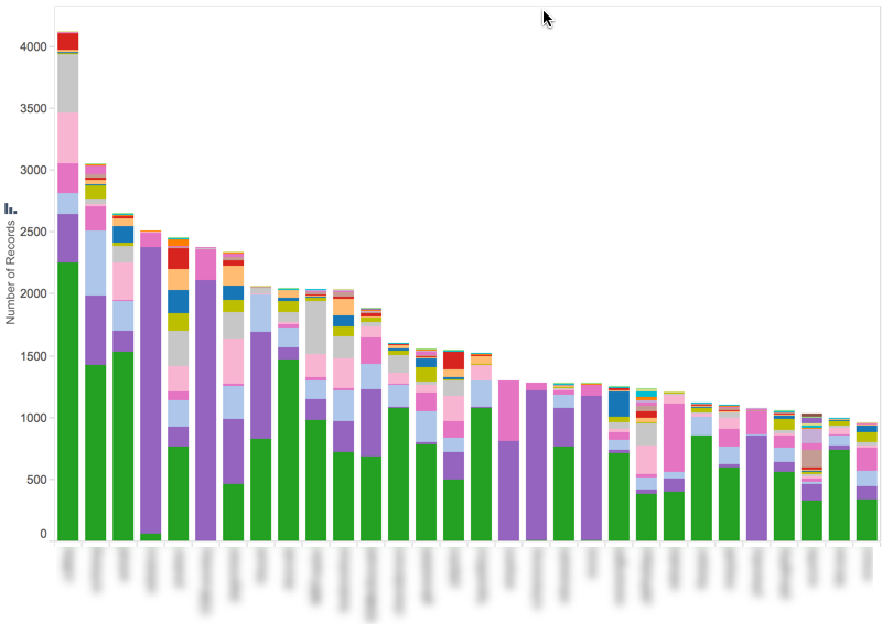
Tableau Example
Here is the target visualization in Tableau. It’s a simple bar chart by username, sorted by the number of report executions, with the individual report names as segments on the bars. Some simple observations are immediately clear:
- Within this sample set, most of the report users appear to have executed between 1,000 and 2,000 reports, with a few users executing at a pace 2x the others. That might be useful information. To somebody.
- The "green" report is very popular, followed by the "purple" report.
- Users who execute the "purple" report in large quantities tend to only run one or two other reports, whereas "green" report users execute a variety of different reports.
Kibana Attempt
For this example, I’ve already loaded the logs and configured the index. Now I’m in the Visualize section of Kibana. To create the following chart, I simply performed the following steps:
- Selected "Vertical Bar Chart" visualization type
- Selected my the index pattern of interest. The Y-axis is already aggregated on Count by default.
- Added a bucket under the X-Axis and selected "Terms" for the Aggregation and "report_name" under the Field dropdown.
- Select Top 30 for the Order and Size of the bucket
Here's the chart, with the Y-axis and X-axis configuration shown.

So far, so good. I have a simple chart showing the most prolific report users. This chart now answers the question, “Which users have executed the most reports during the timeframe specified?"
Now that I have the basic chart setup, I can work on answering other questions, like “Are some of these users only running one or two reports?” Those individuals may be good candidates for future UAT work and soliciting ideas for new enhancements.
I’ll add a sub-aggregation to the X-axis and then choose the option for “Split Bars.” I’m going to aggregate on a term, just like for username. I’ll choose report_name for the field and for the Order I’ll choose “Top 100.” Here's the updated chart:
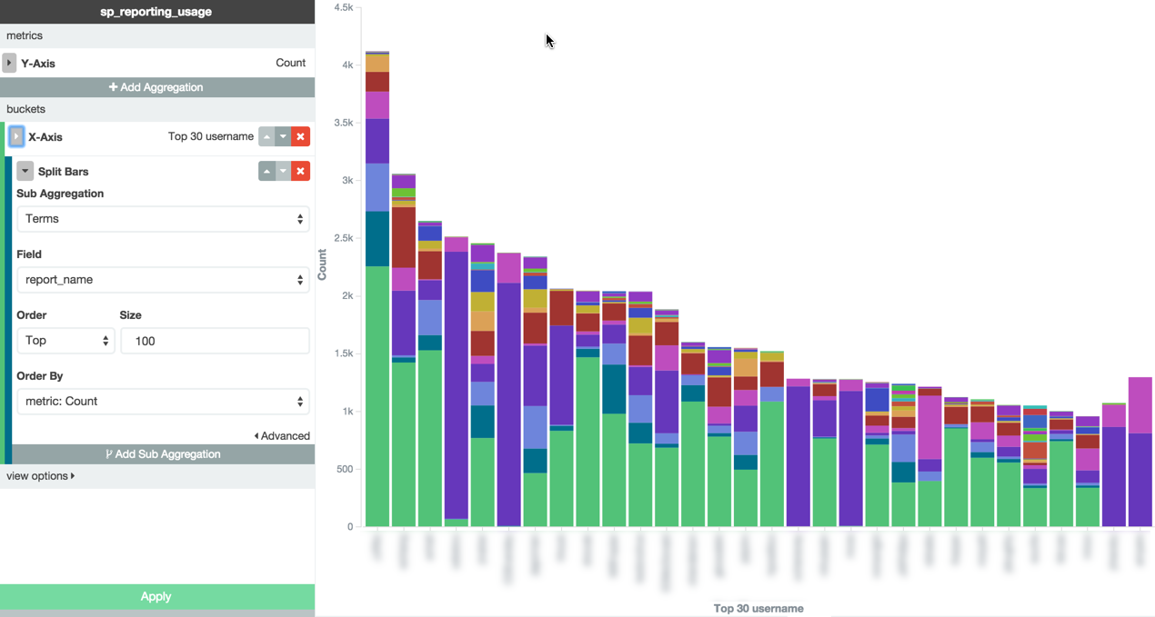
Done, right? Now I can just copy and paste this into my summary of findings or onto a slide for a presentation. Wait a second… Something is not quite right. At the far right of the x-axis, the bars actually increase in height. I'm pretty sure that's a sort problem. It definitely didn't happen in my Tableau example using the exact same data set!
This is where using Elastic under the hood for the visualization becomes very apparent. We're not in a relational model any more. Kibana doesn’t have an option for adding a new dimension to the chart, only a new sub-aggregation. In this case, that’s exactly what’s happening — Kibana is aggregating the subset of documents selected in your first aggregation.
Here’s what I set out to find: the reports executed by each of the top 30 usernames in our report logs.
Here’s what I got in my chart: the top 30 usernames in our report logs in two buckets, both buckets sorted by the number of total executions. The sub-aggregation on report_name created a second bucket.
Looking back at my original observations in the Tableau report, I'm reminded that I noticed that "purple" report users were very exclusive in their report loyalties. So loyal, in fact, that two of them have never, ever, executed the "green" report. Thus, those two Top 30 users could not be included in the first bucket of users -- and the first sub-aggregation sorting -- because they had never executed that report. The next bucket, however, was the "purple" report, and so those two users were sorted and rounded out the 30 bars.
This lesson highlights two important reminders when working exploring and reporting on data:
- You have to understand how your tool works. Unraveling the buckets took a few minutes of focused effort to confirm the true reason for the behavior. There are five users in the Top 30 that appear to have never executed the "green" report. I had to dig into the underlying data to confirm that only two users truly had 0 executions in the sample set. Had I been more familiar with Kibana and how it aggregates buckets, I would have more quickly understood what was being presented.
- Understanding the business perspective always increases the understanding of the data. Because of our familiarity with the reports and who uses them and why, it was very easy to match the business reality to the story Kibana was telling us. In our case, the heavy "purple" report users are members of a team who specialize in the information that comes from that report, and they don't have much need to look at the other reports.